PEN + MOUSE
SUBURBAN UNEASE
This thesis takes a stance on our ubiquitous handling of suburban developments through the search of the aesthetic that I define as, Unease. Unease is a design approach that takes a familiar typology and manipulates it to a certain point that evokes a state of awareness of space, material and relations. The pursuit of Unease looks to eliminate the limitations of the domestic and in turn alter our expectations. It also seeks to reevaluate the notion that the ‘Mcmansion’ is suitable for a single family, by instead, interlocking multiple volumetric units and eliminating inefficient redundancies. This creates an opportunity for a range of spaces that are both, indoor and outdoor, intrusive yet recessive and private but communal.
Unease creates a tension and balance between the commonplace aesthetic and design of suburbia, with a systematic design approach that fractures the predictable qualities we associate with the domestic.


CLOUD PARK
The Cloud Office Park was a response to the existing EOM ‘Pterodactyl’ located on an existing parking garage. It began as a critical response to the existing office space; as a project that would be better suited as a lifted entity, floating above the garage. Utilizing the existing structure, a new network of weaving structural beams acts as a formal driver that created the undulating soffit. Elevationally, the project wanted to be different in every view, giving a strong symbolic presence. However, randomized changes wouldn’t suffice and apertures began to respond to lighting conditions and cardinal directions, while the form was cut and shaped by the existing thoroughfares. Green space and park space was then introduced on every level, giving back the square footage taken by the garage.
In Collaboration with Anna Grininger


STILL A TOWER?
The project necessitated a tower on a small site in Culver City. Due to zoning and height limitations on the property, it was decided that a ‘tower’ in the basic sense would not be possible. So, the problem then became, how does one put a tower on a site with a fifty-five height restraint? It was decided the project would be designed as a 300’ skyscraper, that would subsequently be turned on its side, bridging across the street and developing a more cohesive program. By connecting the existing UCLA building to this site through the ‘Tower-Bridge,’ a more effective use of the Tower scheme allowed for a larger program that better suited the school. Dormitories and lecture halls were introduced, creating a strong linear project. It does bring into question, what happens when floor plates become walls? Or when columns become beams?
In Collaboration with Anna Grininger


SCI_ARC EXPANSION
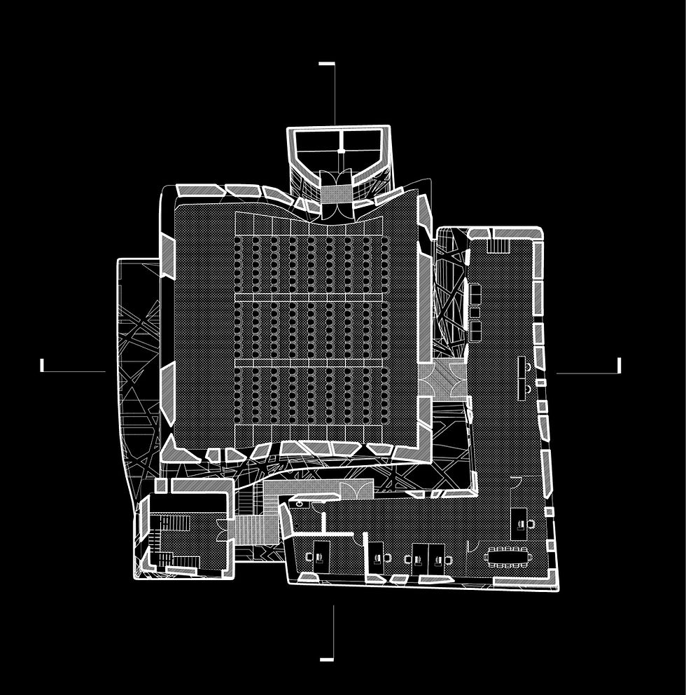
SCI-Arc looks to create an expansion, on site, to allow for a more breathable program. Contorted Object, puts SCI-Arc on a plinth, centered in the arts district to make a statement. The massing is derived through an object style scheme, and programs are wrapped around one other, creating a multiplicty of outdoor space. A structural frame network weaves its way through, connecting each mass and creating structural stability. Circulation from one mass to another always occurs externally, allowing users to experience the frame and intricate in between spaces. Glazing was produced through a series of projections to each mass, giving cohesion, but difference among each component. A distorted LA grid, is then projected onto the plinth, creating holes, walkways, and material differentiation, tying in the existing SCI-Arc building to the new Contorted Object.


CONTORTION
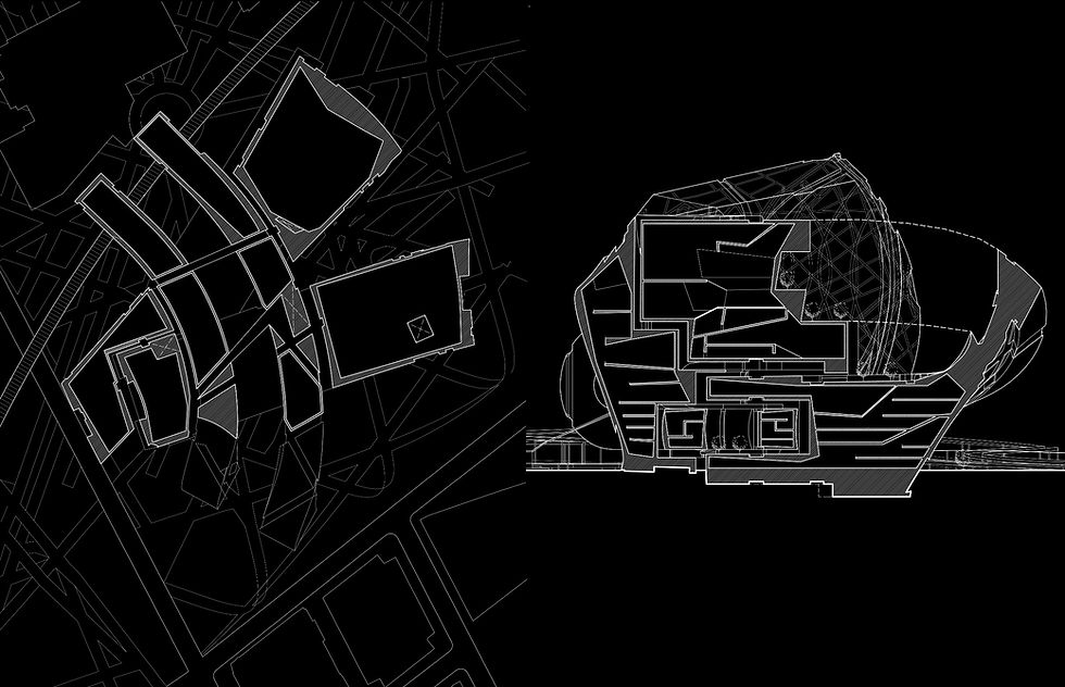
Formal generation began with a precedent building, the Fiat Lingotto. The program for the city scale building was 3 million square feet divided into 3 different programs. The design created a large scale bounding box in which three Lingottos were contorted around one another, creating a series of occupiable interstitial spaces. Where massing began to intersect one another, a piece would carve a void into the other, allowing each piece to miss, while creating more usable space around the pieces. Depending on program, each mass would begin to form a more open or closed form to allow for usable space, as such; the retail became a thick mass to give a higher FAR, and residential remained fragmented to provide privacy. The office space was something in between, giving flexibility to the program. A grid network was projected onto the facades, creating a series of panels, and circulation paths connecting each mass.


FORMAL EXPRESSION
My take on formal exploration through a combination of analog and digital processing and post-processing.


